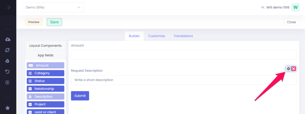
To add an app field to your form, drag and drop the app field from the left side pane into the desired location of the form.

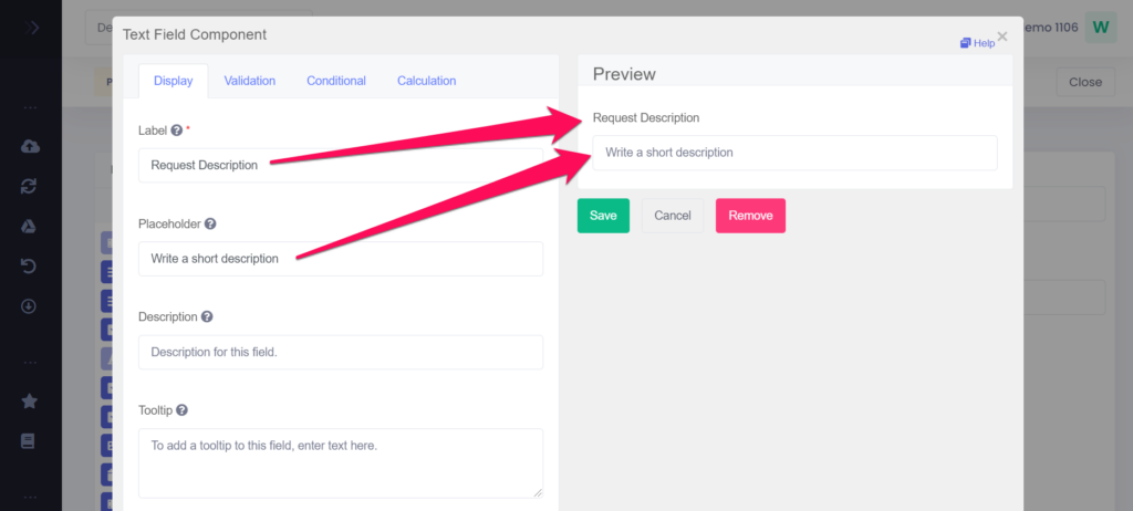
When you drop the app field, the form settings for that app field will open. The settings for a app field are different for each component type, but the following parameters are usually present:
- Label: The name or title for this component
- Placeholder: The placeholder text that will appear when this field is empty. The placeholder function is not available for multi-line text fields.
- Tooltip
- Description
- Default value: This value will be filled in by default
On the right side of the settings pop-up you can see a preview of how the form will be displayed. Once you have filled in the parameters, click Save to add the form component to the form.

To edit an app field on the form, hover over the component and click the gear icon. This will open the settings pop-up. To remove an app field, click on the cross icon next to the gear icon. You can add an app field again after removing it.

